An interactive map of vanishing employment across the country. – By Chris Wilson – Slate Magazine
Stunning visual impact.
January 2007 >>> February 2009
An interactive map of vanishing employment across the country. – By Chris Wilson – Slate Magazine
Stunning visual impact.
January 2007 >>> February 2009
40 Amazing 3D Fractals Using Apophysis
Apophysis is a free Windows program for designing and rendering fractal flames, available from SourceForge .
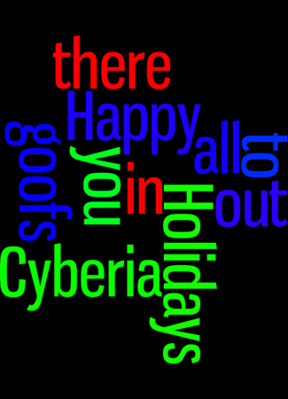
Learned about Wordle via cygnoir. Played with it with my Delicious bookmarks as the resource.
Saved the Java applet results with CutePDF Writer, then pulled the PDF into Photoshop, messed with it and saved it as a .jpg.
Voilà!

So, a bit early, but heartfelt, nonetheless:
Reverse Graffiti Project, April 2008, Broadway Tunnel, San Francisco.
Brilliant, but … if the work hadn’t been pretty, it would’ve been just as snarly as those folks who spray paint crappy letters on walls.
Good ad for the green cleaner used.
[via Sour Grapes' shared items in Google Reader]
An Updated Analysis of the 2008 Presidential Candidates’ Tax Plans: Revised August 15, 2008 — the Tax Policy Center
Deets [PDF]
Below is yet another tax plan analysis chart, this one from Freakanomics.
 .
.
This graph is weighted to show the percentage of tax revenue from each group and whether that percentage will rise or fall under each plan.
[via another tweet from Tim O’Reilly]
From Viveka Weiley at chartjunk, a rework of the McCain/Obama Tax Plans chart (that’s one for you, nineteen for me) showing the differences between the Republican and Democrat tax cut proposals.
This version of the chart weights the income brackets so a bracket with more tax payers is larger than a bracket with fewer tax payers.

Save that thought.
Powered by WordPress
